How a “Welded-to KDE3.5 User” Began a Move to KDE4.4 Part III “Konquering the Dolphin”
In part II of this series, I stated that there were some important ways in which I found that KDE4.4 was deficient when compared with KDE3.5. These were the Personal Settings controls, the file manager Dolphin and the way in which KDE4.4's complexity has produced what I consider to be abnormal situations in which far more decisions are required to carry out simple tasks. As an example of the latter, I showed that 11 separate mouse selections are required to produce a result in KDE4.4 where a similar practical result requires only two such selections in KDE3.5. In this section, part III, I examine one of these problems in more detail: the Dolphin File Manager. I intend to show that, despite my earlier statements, I was eventually able to make Dolphin behave in a way that is almost identical to the behavior of Konqueror in KDE 3.5 . The reader should also be aware that my use of Konqueror in KDE3.5 was relatively simple. Most, if not all of my activities involved: copying of files, relocation of files, creation of folders, searching for folders or files and renaming files or folders and I shall restrict myself to this set of procedures. 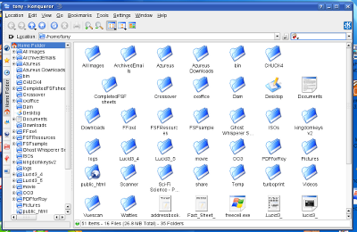 As can be seen, the default display consists of two views or columns whose size can be adjusted by moving the central bar. The left hand column contains a tree presentation of the file system and this can be opened or closed by selecting the small “plus icons” at the front of a folder name. You can scroll up and down and if necessary, you can move to a higher level in the folder structure by selecting the “up arrow” on the tool bar. If any folder in the tree is selected, its contents (folders and files) are immediately displayed in the column on the right hand side. You can also copy files or folders from one side to the other if you wish using the usual “drag and drop” method. The right hand display can also be interchanged between a tree and icons simply by selecting the appropriate icon on the tool bar. Occasionally, there are file-copying situations in which it is very useful to have two separate copies of Konqueror running simultaneously and this is not a problem. Files or folders are dragged and dropped across the two separate copies in the usual way. USB sticks are an excellent example where this situation occurs routinely since insertion of a stick automatically opens a sub-window asking if you wish to open the stick in a new copy of the file manager. I should like to preface my discussion of Dolphin with a few remarks. For the past 3 months I have experienced varying degrees of frustration when using this piece of software and it is only a few days ago that by sheer luck or accident I have finally solved all of my problems. In part II of this series I seriously attacked Dolphin's abilities and its lack of facilities and I should like to put the record straight in part by saying that what I wanted out of Dolphin was already there: it was simply that I did not know how to get at it. From my perspective, the solutions were somewhat difficult to find but are blindingly obvious once you are aware of them. That in turn raises some more questions, but more of those later. The Dolphin Default Screen 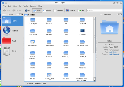 As can be seen, this differs considerably from the default view of Konqueror in KDE3.5 and this brings me to my principal complaint for the KDE4 team: in view of what I have now found, I find it incredible that the KDE4 team chose to make the above screen the default view for Dolphin. To ease newcomers upgrading into a novel piece of software, at least make the interface resemble something that they are used to. It's a rule that too often I find has been broken by KDE4. For three months on various occasions, I have fought with Dolphin. Obviously, the display suggests that you are dealing with columns, and if you select View from the Menu bar you will find an option called “Split”. This does indeed split the central column, but each side is then operating completely separately. I also tried working with the tool bar selection of “Columns”; this certainly splits the screen in two, but one half is grayed out and there is no indication of what you need to do to activate it. I did manage at one point (and at that stage I could not remember how I finally got there) to split the screen in two and have a tree down the left hand side with icons down the right hand side. However, each was totally independent of the other and the moment I closed Dolphin, it lost all those settings. Frustration wasn't an adequate term. I thought too, that perhaps Konqueror in KDE4 still retained its usual interface despite the fact that it is now the KDE4 browser. It is easy enough to find the appropriate place in Personal Settings and make Konqueror the default file manager, but to little purpose. Konqueror has now been worked over to make it into a nearly dedicated browser and I gave that idea up very quickly. The Dolphin “Panels” Part of the problem is that for some aspects, Dolphin uses a different term for what the Konqueror user would simply call a “column” and again, I think that KDE4 has moved to terminology complexity rather than simplicity. Dolphin uses the term “panels” for these vertical, rectangular side columns. As far as I am concerned, “panels” are to be found at the borders of the opening screen of the operating system, and they contain the launcher icon, clock, and a variety of other information, but that concept now needs to be altered for Dolphin's special formats. The procedure used to transform Dolphin into a KDE3.5 Konqueror mode is so absurdly simple, I am still amazed that it took me 3 months to ultimately find it. You can of course say very loudly: “Read the (blank) manual”.......My response is two fold: first, I expected Dolphin to behave in a similar way to the file manager I had left behind with respect to the display formats, but in a number of aspects it doesn't; and second, the help manual certainly would help its writer, but its contents are not exactly clear to a confused person trying to learn a new piece of software. To put it another way, once I had figured it out for myself, I could understand exactly what the manual was trying to say. From here on, the two side columns of Dolphin will be referred to as panels. If you examine the default screen of Dolphin, you can see that the left hand panel is titled “Places” and the right hand panel is titled “Information”. In addition, you can see that these panels can be maximized, minimized or deleted. When I first deleted them out of simple curiosity, they remained deleted after I closed Dolphin and restarted it...it took some time for me to work out that I could replace them by choosing View from the menu bar, followed by Panels and then Places and Information respectively. And why I did not then link the term “panels” with my needs I have no idea. Possibly information overload, but also possibly because I was searching for anything that would display a “tree” mode, and this term is neither suggested by nor present in the various menu headings. Changing Dolphin's format to a KDE3.5 Konqueror display To get Dolphin into a KDE3.5 Konqueror display, three small steps need to be taken: 1. Select the “close” button on the top right hand corner of the Places panel, and it will disappear. 2. Select the “close” button on top right hand corner of the Information panel, and it will disappear. The Dolphin window will now be a plain window full of icons and one more step needs to be taken. 3. Select View on the menu bar, followed by Panels from the drop down menu, and then “Folders” from the second drop down menu. 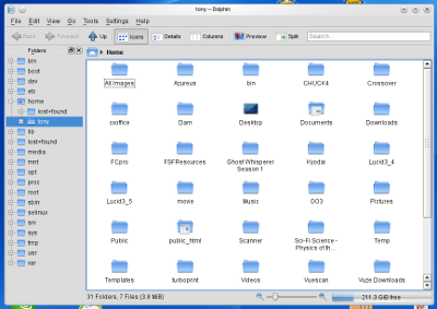 This is the classic Konqueror view and it behaves in exactly the same way, such that if you open a folder on the tree, it will open the folder as icons in the main window. You can copy back and forth and all in all, it does exactly the same tasks with the same display background as a KDE3.5 user would encounter with Konqueror. Even though the Folders panel appears to be a separate entity, you can drag the central bar to increase or decrease the size of each area of the window, just as could be done with the central bar of Konqueror in KDE3.5. Best of all, Dolphin remembers your settings for this window so if you close and restart Dolphin, you will have the same display format. File paths, “Bread Crumbs” and the Terminal in Dolphin The line immediately above the main window, the Location Bar, shows the active file path for the default display in what the Dolphin manual terms the “Bread Crumb” mode. I, personally, prefer the conventional display (Dolphin calls this the “Editable” mode) in a true text entry window using the “/” symbol rather than an arrow head, simply because that can be copied and pasted very easily. This is particularly useful if you get Dolphin to search for a file and you need to insert the location in either a separate document or a CLI procedure when using a terminal window. In its default window display, Dolphin uses the Bread Crumb mode but I suspect most users will want to use the Editable mode so that they have immediate access to “copy and paste”, and an example of Dolphin displaying Editable mode is given in the screen shot below: 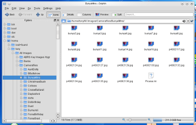 There are two ways of reaching Editable mode. The first is a temporary one in which you click once in the gray area at the end of the Bread Crumb mode path display on the Location Bar. The display will immediately transform to the Editable mode path display. You can also flip back to the Bread Crumb display by selecting the “tick” button at the right hand end of the Bar. Many users may prefer to have a permanent Editable mode displayed. That is easily done with the following selections starting from the Menu bar. Choose “Settings” followed by “Configure Dolphin” from the drop-down menu. This will open the Dolphin Preferences window and the necessary selection of “Startup” is open by default. Tick the box which is labeled “Editable location bar”, then select “Apply” and finally “OK”. From now on, Dolphin will display the Editable location bar when it starts. Note however, that you can still select the green “tick” button at the end of the Bar and the display will revert to the Bread Crumb mode, or again select the gray area to return to Editable mode – but no matter which is finally present, from now on Dolphin will open with the Bar in Editable mode on restarting unless you alter the Configuration settings. I mention here that Dolphin contains an identical procedure to that used in KDE3.5's Konqueror but which I never found occasion to use simply because Konqueror by default provides an “Editable mode” location bar. Dolphin can automatically provide you with a terminal ready to start at the desired file location if you select Tools on the menu bar followed by “Open Terminal” in the drop-down menu. File Searching In previous comments about Dolphin, I wrote that I could not get the software to search for a file. Today, I have the file search function working perfectly at long last, but in this case, I blame the KDE4 team for laying a false trail. If you look at the top right hand corner of the Dolphin window, you can see a text entry area with the word “Search” included. Naturally, I assumed without hesitation this was the file search facility for this new piece of software and therefore looked nowhere else. So, I entered a file name, the Search button appeared and became activated, but when pressed, there were no results. I tried various ways of doing this over several weeks, but this afternoon, I did another check for some other reason and looked at the menu bar item of Tools. If you select this item, you will get a drop down menu with the subheading of “Find File” and from this point onwards, Dolphin behaves in exactly the same way as Konqueror behaves in KDE3.5. I have now successfully found files in any part of my filing system. Currently, I am still exploring the function of that “Search” text entry area at the top right hand corner. Exploring Dolphin: Split Screens Once Dolphin is put into the recognized KDE3.5 Konqueror format, it is well worth exploring. A rather nice attribute is the “Split” button on the Menu bar. This is a “toggle” selection button and it will split the screen into two columns or restore it to a single screen. Each of the resulting columns is independent of the other, but whichever of the two you have selected will also be interdependent with the Tree/Folders panel. You can, if you like, have a tree on one side and icons on the other, or whatever suits your needs or fancy ~ but on closing and reopening Dolphin, a two column split screen will have reverted to a single screen and may be also be a tree or an icon display depending on where you were last working...It is a matter of a moment or two to select the appropriate display using “Icons” or “Details” on the tool bar. An example of the split screen is shown below. 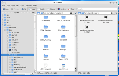 I suspect the Split procedure has another bonus which I have yet to test. In KDE3.5, I have occasionally found it necessary to have two copies of Konqueror running simultaneously when copying files. The Split procedure provides precisely those conditions while running a single copy of Dolphin. Exploring Dolphin: Tabs Tabbed displays are one of those file manager abilities that some will find extremely useful while others have little or no need of them whatsoever. I fall into the latter group, but that is no reason to ignore this interesting little procedure. KDE3.5's Konqueror can display a series of tabbed main displays, each of which can be showing a separate set of folder or files depending on which part of the system filing tree was selected when that tab was active. In Konqueror, you obtained new tabs by selecting Window from the menu bar followed by “New Tab” from the drop-down menu. Dolphin is also able to provide tabbed displays although the menu location to create the tabs is different. To create a new tab, select File on the main menu bar followed by “New Tab” from the drop-down menu. You can create a series of these tabs and, just as in Konqueror, each will display a different set of contents depending upon which part of the main system filing structure was selected when the tab was open and each tab will have the title of that particular active folder. Tabs are easily closed by selecting the usual “tab close” button at the top right of the tab. Multiple panels, floating panels, file/folder information and display tweaks Assuming that Dolphin is not covering the entire monitor display area, I have already found that if you select the “maximize/minimize” icon at the top of the Folders panel, it detaches from the Dolphin window and can be dragged around and used as a floating “toolbar”, however it remains fully linked to the files in the main Dolphin screen. The removal of the Folders panel gives more display area for files if that is your current need. Select the “maximize/minimize” icon once more, and the panel slots back into its normal position. You can even have two panels at a time on the left hand side. Whether you keep the Information panel is really a matter of choice, but by default, Dolphin does not display a floating information output when the cursor is placed over a file or folder. You can get Dolphin to do this via the “Settings” control on the menu bar. Select Settings followed by “Configure Dolphin” from the drop-down menu and then select “General” from the side panel. The “Behavior” tab is open by default and towards the bottom, select the box beside the heading “Show tooltips”. This will allow you to have a floating information box appear when the cursor is held over a file or folder. Beside “Show tooltips” is the word “Configure”. If you select this, you will open a small sub-menu which allows you to decide exactly how much information you want to display in your cursor floating information window. A very brief note of information about file size does appear along the bottom of the Dolphin window but all relevant information about a file or folder is given in the Information panel. I prefer the floating tooltip output and find that the Information panel takes up a bit too much of the display area. You can maximize and detach the Information panel and it still remains detached if you stop and restart Dolphin. It's a different way of doing things and ultimately, it's a user's choice. Examples of the two panel and floating panel layouts are shown below. 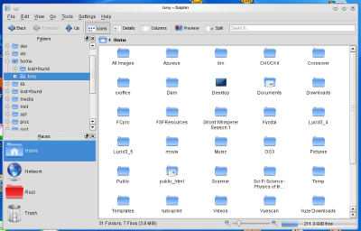 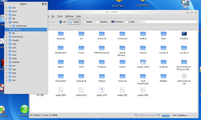 One last minor aspect concerning the main column display is that the size of the icons is controlled by a sliding scale directly underneath the display. You can move the slide control to give larger or smaller views of the icons – the text however, remains the same size. It's one of those controls that I find that I set once, and then forget all about it. If you want to get rid of it altogether, you can, using an appropriate selection in the Configure Dolphin menus. Now that I have Dolphin defaulting to an equivalent of the KDE3.5 Konqueror display and working virtually identically, I am discovering that Dolphin is actually fun to explore. When I think about it, I have removed every irritation or problem that originally arose when I first encountered the software package. Manuals are fine, but they really don't work properly until the user has some familiarity with the software. Now that I am becoming reasonably familiar, I find the manual is a treasure trove of information. Looking back, I think that most of my frustration and problems arose because Dolphin was a totally unfamiliar interface in its default mode, and there were no simple hints as to how I could get it into a familiar format. This is a definite problem that should be kept in mind by the KDE4 team because it is such an unfortunately effective way to alienate previous KDE3.5 users. And that is a crying shame, because from my personal usage perspective: Dolphin may not be perfect, but for my purposes and now that I understand it, I don't know of anything that could do the job better. Dolphin is possibly a more complex piece of software compared with Konqueror in KDE3.5 and I am sure it probably does have some additional facilities that I have yet to explore. Personally, I find that the administration controls are a little bit more “devious/intricate” and (again, as far as I am concerned) less intuitive, but these problems will undoubtedly diminish over time with increasing familiarity. The new term of “panels” for those special columns is a “non-event” once you understand it. I confess with a certain amount of wry humor, that had I not had the incredible strokes of luck a few days ago in which I finally understood both the panel terminology and the correct search routines, I would have made such enormous errors about Dolphin in this part of my series of articles, that it would not have been a simple case of “putting my foot in my mouth”; by now I'd have not only swallowed my foot, I'd be up to the knee as well. In that sense, I'd like to offer a sincere Dolphin olive branch to the KDE4 team: “After all my previous negative comments, I should like to say that I was wrong. Dolphin does work for me when its configuration is set to those parameters which produce a KDE3.5 Konqueror display, and I personally find it excellent for my daily file management purposes.” References How a “Welded-to KDE 3.5 User” Began a Move to KDE 4.4 - Part 1 http://lxer.com/module/newswire/lf/view/144200/ How a “Welded-to KDE 3.5 User” Began a Move to KDE 4.4 - Part 2 http://lxer.com/module/newswire/lf/view/144900/ And thank you as always to Scott Ruecker for his help and encouragement. Postscript: The author wishes to state that he has had some past experience in the production of information manuals for complex biological modeling and key software. He was responsible for the production of the entire first edition software manual for the Lucid biological key software and also has been responsible for the tutorial set and accompanying explanatory notes for the first edition of the CLIMEX biological distribution software. Both of these manuals were written for subsidiary organizations within the University of Queensland, Australia. |
|
| Subject | Topic Starter | Replies | Views | Last Post |
|---|---|---|---|---|
| Glad to see you got it all going. | dinotrac | 27 | 3,486 | Jan 31, 2011 6:39 PM |
You cannot post until you login.

